

How to Curate a Cohesive Home: A Design Guide
Yuatinia LeakTable of Contents
- Define Your Design Style and Vision
- Master Interior Design Color Palette Tips
- How to Mix Decor Styles Without Clashing
- Build Continuity Through Textures and Materials
- Curate Homeware Decorations That Tell Your Story
- Use Lighting and Mood Boards to Unify Spaces
- How to Curate a Cohesive Home Across Open Layouts
- Frequently Asked Questions
Last Updated: August 25, 2026
Define Your Design Style and Vision
Your home's design begins with clarity. Before selecting a single piece of furniture or color, identify the aesthetic that resonates with your values and lifestyle. This foundational step prevents the common mistake of accumulating beautiful items that clash visually and conceptually.
Start by gathering inspiration from sources that genuinely move you. Create a digital folder or physical mood board with images, textures, and color combinations that spark genuine emotion. Look for patterns in what attracts you. Do warm, earthy tones dominate your selections? Are you drawn to minimalist spaces or richly layered interiors? These patterns reveal your natural design inclinations.
Consider your home's architecture and existing bones. A Victorian home with original moldings calls for a different approach than a modern open-plan apartment. Work with what you have rather than against it. Your design style should feel inevitable within your specific space, not imposed upon it.
Define your design style in concrete terms. Rather than vague descriptors like "eclectic," articulate what that means for you specifically. Perhaps it's "global bohemian with a neutral foundation and warm metallics" or "contemporary minimalist with handcrafted natural materials." This clarity becomes your decision-making filter for every purchase and placement decision going forward.
Master Interior Design Color Palette Tips
Establish Your Neutral Base
A neutral base provides visual rest and allows accent colors to perform their intended function. Neutrals aren't boring when selected with intention and layered thoughtfully throughout your space.
Choose your primary neutral for walls, larger furniture pieces, and foundational elements. This becomes the canvas everything else sits against. Consider warm neutrals like cream, taupe, or soft greige for spaces that feel intimate. Cool neutrals like pale gray or soft white work well in spaces meant to feel airy and expansive. The undertones matter significantly. A gray with warm undertones feels entirely different from one with cool undertones, even when the base color appears identical (peer-reviewed research).
Layer your neutral base with variations in tone and texture. A room painted in a single flat color feels flat. Introduce lighter and darker variations through textiles, wall treatments, and furnishings. Cream walls pair beautifully with ivory linens, beige upholstery, and warm wood tones. This creates visual interest while maintaining cohesion.
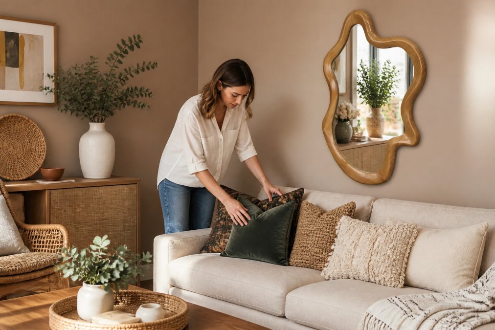
Neutral bases also serve a practical function. They allow you to refresh your space seasonally or as your taste evolves without major renovations. Swap accent pillows, rotate artwork, and introduce new textiles without fighting against a dominant wall color.
Layer Accent Colors Strategically
Accent colors inject personality and visual flow into your interior design color palette. Rather than spreading them randomly, place them intentionally where they anchor spaces and guide the eye.
Select two to three accent colors maximum. More than this fragments the visual story. These colors should work harmoniously together and feel authentic to your overall design theme. Consider warm and cool tones. A space with only warm tones feels heavy; one with only cool tones feels cold. Balance creates sophistication.
Place your primary accent color in multiple locations throughout your home. Repeating a jewel tone in artwork, throw pillows, and a decorative object creates visual continuity across rooms. This repetition is what transforms random color choices into an intentional design strategy.
Use your secondary accent color more sparingly. A small amount of a contrasting hue adds visual interest without overwhelming the space. Perhaps it appears in a single artwork, a ceramic vessel, or a carefully selected textile. This restraint is what distinguishes curated interiors from chaotic ones.
How to Mix Decor Styles Without Clashing
Mixing styles successfully requires understanding what unifies disparate pieces beyond their aesthetic. The key lies in intentionality and restraint rather than random combination.
Establish a clear primary style that anchors your home. This becomes your foundation. If your primary style is contemporary minimalist, your secondary style might be organic bohemian. The contemporary elements keep the space grounded and clean. The bohemian elements add warmth and personality. Without a strong primary style, mixing becomes visual chaos.
Create visual weight balance across your space. Heavy, ornate pieces need lighter, simpler pieces nearby to avoid overwhelming a room. A carved wooden mirror benefits from minimalist shelving beside it. An ornate rug grounds a space with simple furniture. This balance is what prevents mixed styles from feeling accidental.
Repeat materials and finishes across different style categories. If you're mixing bohemian and contemporary pieces, use the same wood tones, metal finishes, and textile materials throughout. A handwoven jute rug pairs beautifully with a contemporary sofa when both feature natural, undyed fibers. Material consistency creates coherence that style mixing alone cannot achieve.
Consider the color story as your unifying element. When all pieces, regardless of style, share a cohesive color palette, they feel intentional rather than mismatched. Warm metallics throughout a space tie together a vintage mirror, contemporary art, and bohemian textiles. This is how you curate a cohesive home from disparate elements.
Build Continuity Through Textures and Materials
Texture creates visual depth and invites tactile engagement with your space. A room with only smooth surfaces feels sterile. One with varied textures feels inviting and layered.
Identify your primary material. Perhaps it's natural wood, metal, or stone. This material appears in multiple locations throughout your home. It becomes the thread connecting rooms and creating spatial harmony. Wood tones flowing through flooring, furniture, and accessories unify a space across different style categories.

Layer complementary textures strategically. Soft linen pairs with rough jute. Smooth ceramic contrasts with woven fiber. Polished metal catches light against matte wood. This variation in texture keeps the eye engaged without introducing visual chaos. Each texture should feel intentional rather than accidental.
Repeat textures across different materials and rooms. If you introduce a woven texture through a jute rug in the living room, echo it with woven baskets in the bedroom or linen curtains in the kitchen. This material repetition creates continuity that ties your entire home together. It's the difference between a collected space and a curated one.
Consider the tactile experience of your home. How does your space feel when touched? Rough, smooth, soft, hard? The most sophisticated interiors balance these sensations. A space that's entirely soft feels indulgent but ungrounded. One that's entirely hard feels cold. The interplay between textures creates a space that feels both beautiful and livable.
Curate Homeware Decorations That Tell Your Story
Your homeware decorations should reflect your values, travels, and personal narrative. This transforms your home from a styled showroom into a space that authentically represents who you are.
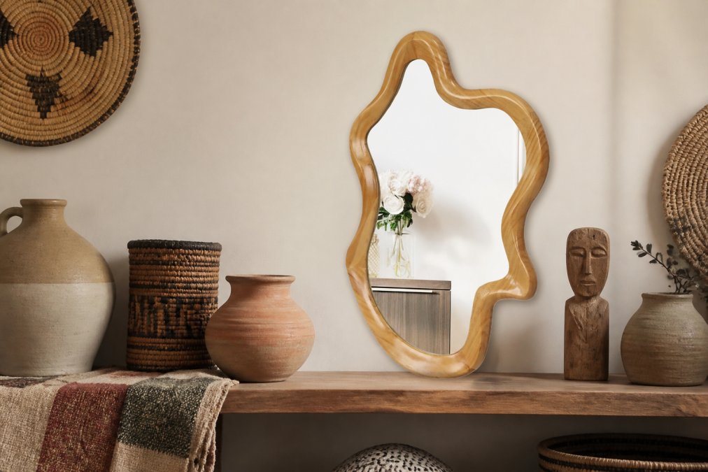
Select pieces with intention and restraint. A single beautiful object displayed thoughtfully has more impact than numerous mediocre items crowded together. Consider each piece's story. Where does it come from? Who made it? What draws you to it? These narratives become the threads connecting your home to your identity.
At Fluent Trends, we believe your home should reflect your values. Our Artisan Collection features handcrafted pieces from women-owned businesses and global makers. Each item carries a story of ethical craftsmanship and cultural heritage. When you choose pieces that align with your values, your home becomes an extension of your beliefs.
Edit ruthlessly. A common mistake is keeping everything because it's beautiful or meaningful. The most curated homes practice intentional editing. If a piece no longer serves your aesthetic or story, it's time to release it. This doesn't mean your home should feel sparse. It means every item earns its place through genuine resonance rather than obligation.
Group similar objects thoughtfully. Collections of ceramics, textiles, or vintage finds create visual interest when arranged with purpose. A shelf displaying handwoven baskets, ceramic vessels, and natural fiber objects feels cohesive. The same items scattered randomly feel chaotic. Grouping creates narrative and visual weight.
Use Lighting and Mood Boards to Unify Spaces
Lighting functions as an invisible design element that dramatically affects how colors and textures appear. Warm lighting transforms cool-toned spaces into intimate environments (ies.org). Bright, cool lighting energizes neutral palettes. Consider lighting as part of your interior design strategy, not merely functional necessity.
Layer your lighting approach. Ambient lighting provides general illumination. Task lighting serves specific functions. Accent lighting highlights architectural features or artwork. When these three types work together, they create visual flow and spatial harmony. A room with only overhead lighting feels flat. One with layered lighting feels intentional and sophisticated.
Create a mood board for each major space before committing to purchases. This visual reference tool prevents costly mistakes and ensures cohesion. Your mood board should include your chosen neutral base, accent colors, texture samples, and key pieces you've already selected. As you add new items, test them against your mood board first.
A mood board serves another critical function. It helps you see your design vision in context before implementing it. Colors appear differently in isolation than they do alongside other elements (peer-reviewed research). Textures interact with surrounding materials. Your mood board reveals these relationships before you've made financial commitments.
Revisit your mood board regularly as your space evolves. A mood board isn't static. As you add pieces and discover what works, update it. This keeps your design direction clear and prevents drift into visual chaos. The most cohesive homes maintain this intentional approach throughout their curation process.
How to Curate a Cohesive Home Across Open Layouts
Open-concept spaces present unique challenges for maintaining visual continuity. Without walls to define distinct areas, how do you create spatial harmony while allowing different zones to function independently?
Define zones through design elements rather than walls. Use your neutral base to unify the entire space. Walls, flooring, and ceiling color should flow seamlessly from kitchen to living area to dining space. This visual continuity prevents the space from feeling fragmented.
Create visual separation through furniture arrangement and accent colors. A specific accent color might anchor the living area while a different accent color defines the dining space. These colors should relate to each other through your overall palette. Perhaps one is a jewel tone and the other is a warm metallic. The relationship between them matters more than their individual presence.
Maintain material consistency across zones. If your living area features natural wood and linen, your kitchen should incorporate these materials too. This doesn't mean identical furniture. It means the fundamental materials and finishes remain consistent. A wooden cutting board on your kitchen counter echoes wooden furniture in your living area. Linen kitchen towels relate to linen upholstery nearby.
Use lighting to define zones without walls. Pendant lights over a kitchen island create visual separation from a living area. A floor lamp in the corner of a seating area anchors that zone. Lighting placement guides the eye and creates implicit boundaries that feel natural rather than imposed.
Consider traffic flow and sightlines when curating open spaces. What do you see when you enter the room? What's visible from the kitchen? These sightlines matter enormously. Position your focal points strategically. A statement mirror or artwork should be visible from multiple vantage points. This creates visual interest throughout the space and prevents any single zone from feeling isolated.
Creating a cohesive home requires patience, intention, and willingness to edit ruthlessly. The most beautiful spaces aren't filled with the most expensive items. They're filled with pieces chosen deliberately and arranged thoughtfully.
Fluent Trends offers handcrafted homeware decorations and artisan furniture designed to support this intentional approach. Our Irregular Wall Mirror with Natural Wood Frame and Blackwash Mango Wood Wall Mirror serve as statement pieces that anchor spaces while reflecting your commitment to authentic craftsmanship. Each piece in our collection supports women-owned businesses and global makers, transforming your home into a reflection of your values. Shop Now and begin curating a space that tells your story.

Frequently Asked Questions
What is the 60-30-10 rule in interior design?
The 60-30-10 rule is a foundational formula for how to curate a cohesive home. Allocate 60% of your space to a dominant color, 30% to a secondary color, and 10% to accent colors. This mathematical approach ensures visual balance and prevents your interior design color palette from feeling chaotic or overwhelming. It works across any style, from minimalist to eclectic.
How do you create flow between rooms with different styles?
Maintain flow by repeating key design elements across spaces. Use a consistent neutral base color throughout transitional areas like hallways and entryways. Echo material choices, such as natural wood or linen, from room to room. Limit your accent color palette to two or three hues maximum. This creates visual continuity even when each room expresses a distinct personality or aesthetic.
Why is texture important when curating a home?
Texture adds depth and prevents your space from feeling flat or sterile. Layering different materials like wool, linen, jute, and ceramic creates visual interest and tactile richness. Texture also helps unify disparate pieces by creating a cohesive sensory experience. When you mix decor styles, consistent texture choices make the overall composition feel intentional rather than random.
What makes a house look cohesive versus chaotic?
Cohesion comes from intentional repetition and restraint. A cohesive home repeats colors, materials, and design themes throughout. It avoids the trap of collecting pieces without a unifying thread. Editing is essential: choose fewer items with intention rather than filling every surface. A mood board helps visualize your design story before purchasing, preventing the hodgepodge effect that signals lack of planning.
This article was written using GrandRanker